Friday, 26 November 2010

Television Advert Research

We have now started the next assignment on Television Advert Project, we watched a number of Television Adverts that were very explicit & were banned from UK Television, it gave me a good insight into Legal & Ethical Issues & the creation of Television Advert. I am now working on Research into Qualitative & Quantitative Research, Primary & Secondary Research, Research into Dewey Decimal System, & Research into Viewing/Listening/Reading figures.    

Dewey Decimal System
The Dewey decimal system is used in more than 200,000 libraries throughout the world and it has been translated into 35 languages. The Dewey decimal system, using numbers and letters, coordinates materials on the same subject and on related subjects to make items easier to find on the shelves..  All knowledge is divided into ten main classes, which are listed below :
        
000 Generalities 
100 Philosophy and Psychology
200 Religion
300 Social Science
400 Language

500 Natural Science and Mathematics
600 Technology (Applied Sciences)
700 Arts
800 Literature
900 Geography and History

Wednesday, 24 November 2010

Responding to Feedback


Today i recieved valuable feedback on my progress from Harry, with my progress so far & my targets which i noted down to improve on:
  • Look at Production Guildlines on Chichester Online to organise my folder.
  • Edit my images to make them appear more darker & relate to the genre Horror more by adding textures blending in with the images.
Afte recieving feedback from my DVD Menu, i have looked at the Production Guidlines & have ordered my folder correctly & created a contents page indicating what pages are within my folder. I have also edited my images with added texture of 'ripping', & de-saturated the images, to make them appear darker & scarier, also to relate to the genre more.

Friday, 19 November 2010

Reflecting on my Progress

 Through this DVD Menu Assignment I've learnt:
  • How to add animation & link pages in Encore, by in Adobe Photoshop with the animation export & render so it will convert to a mov, then import it as a timeline into Encore.
  • Aspects of Adobe Photoshop CS3, i also had background knowledge, however from this assignment I've learnt the use of History tool, Clone Stamp Tool, Dodge Tool, which has helped me so much when creating my DVD Menu.
  • The use & importance of Mood boards, I've learnt the use of mood boards which is created by cut outs from magazines, images from the Internet, annotations, fonts etc, & the importance as it enhances the development of your ideas furthermore & creates the mood of the genre.
  • The importance of Research, previously doing GCSE Media & AS Level Media, i did a lot of research, but this assignment made me realise there's never 'too much' research, research is vital in the media industry which I've found out, & it does help with developing ideas.
  • Through research into DVD Menu, i learnt what a rollover effect is, when selecting a font or image it highlights so you know what one you're choosing, it is interesting making my own with the codecs.
  • I learnt how important Canvas size (International - A4 ) & resolution (100-150) is on Photoshop CS3, it has helped me a great deal, & I'm glad i learnt this, because canvas size & resolution makes a massive difference.
  • Being introduced to the website Blogger for coursework, i've really enjoyed! I can update & show my work, what i've learnt, problems, new skills & when going back & reflecting, it's so much better then just having it in a folder. Also being seen on this website, is like my own website of my work & thoughts, i think it's such a good idea, & you can represent your work how you want, not just on paper.
  • I've learnt about Different Image file formats which i'm really glad, e.g. Psd's to keep all layers to go back & edit, which has helped me a lot when creating my DVD Menu, i never knew this before & woundered why i use to have some problems when trying to upload & they were either too big or would refuse, & also JPEG to save an image & be able to successfully upload to the Internet, which i didn't know before, & has helped me when i created my own Website & to upload on Blogger.

Tuesday, 16 November 2010

Completion of DVD Menu in Encore

I have now completed my DVD Menu in Encore with all inter-links. I've linked all 7 pages with each other & with a Easter egg to link back to homepage. I'm really pleased about my DVD Menu, however there were down sides. I had to alter some things, i highlighted the images but it wouldn't appear on Encore, this was a problem.

To resolve this problem i, therefore had to change it & instead highlighted the font of the Scene Selection which i prefer now. The genre i was going for, Horror, i feel is successfully portrayed across to the audience, with the colours, images, fonts etc. & is how i visually expected of my DVD Menu. I also added my Animation which was more in-depth then i thought, but after some investigation into Encore i soon found to export an image in Photoshop as 'render video' then import into Encore as a Timeline. After this, i linked them all together & i'm really pleased with  it. I'm now going to download my audio of Horror sounds to then import into Encore onto my Main DVD Menu. I'm going to use a sound which presents Horror, e.g. screams, wolfs, witches etc. These all imply the Horror Nature.

Friday, 12 November 2010

Preparing for Encore & Progress of DVD Menu

Preparing for Encore

Encore needs Codecs to highlight rollover effects for images & texts. I have put all layers into specific groups i.e. texts, images etc. with their ideal codecs i.e. (=2) will highlight the text/image. I opened a new project in Encore called 'DVD MENU', & the majority of my rollover effects were successful, however some weren't.

On the scene selection the 'rollover effect', is already seen when highlighting the chosen option it doesn't change, this is a problem. I will have to change codecs & make sure all rollover effects. I still need to link all my pages but at the moment, it is successfully a new project saved. I was hoping to be able to link all DVD Menu Pages together, but unfortunately as these slight problems, i cannot just yet. I look forward to seeing my final project with rollover effects, links etc.

I have now decided to alter a few things, as there are slight problems with the rollover effects, I've decided to highlight the text as a rollover then the image, i think it appears subtle but more effective. I've also linked all DVD Menu Pages together successfully with links to go back to homepage also, I've put it into my DVD MENU Project on Encore & imported my Animation.


Progress of my DVD Menu

My DVD Menu pages are complete & ready for encore, however i have made some adjustments. Firstly i created & made my rollover effect a hand holding a knife, which i felt related to the genre Horror, however my DVD Menu i wanted to be simple but still effective, & i felt as if an image for a rollover effect was too much & made it slightly confusing & defeated the point of keeping it simple & clean. I therefore changed it a simple roll over effect colouring the Title option red, to relate to the genre Horror and represent blood. I prefer how I've changed it & i believe it keeps with the simplicity throughout my DVD Menu but still effective.

Wednesday, 10 November 2010

Story Board of Animation

For my DVD Menu, i have added the element of Animation to appear more scary & spooky. My Main DVD Menu is a simple image of a skeleton doll hanging from a tree. Therefore i have incorporated animation through animation frames, i've made the first frame opacity of 0% so the image doesn't appear at all, i have then duplicated this frame & made the 2nd frame opactify of 100% therefore the whole image shows in its fullest form. I then clicked on 'tweens animation frames', where the in between frames show the progress between the image seen as nothing to showing. I chose this animation, to create the feel that the skeleton doll is irocincally a 'ghost' & appearing from a tree. I feel this gives a creepy/spooky fell & effect & works well. For the animation, i also created the storyboard with the frames to show visually what i planned & now have achieved.

Tuesday, 9 November 2010

Update of my DVD Menu Pages

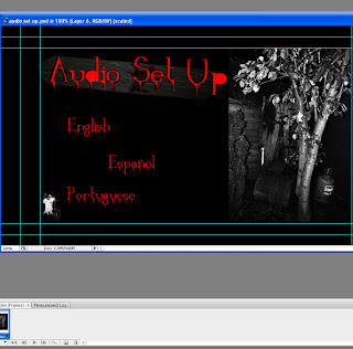
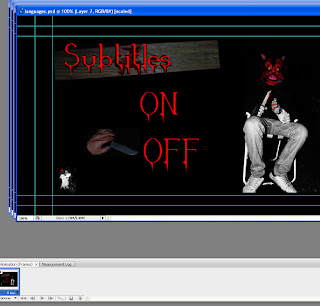
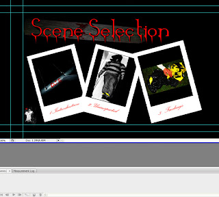
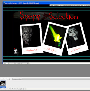
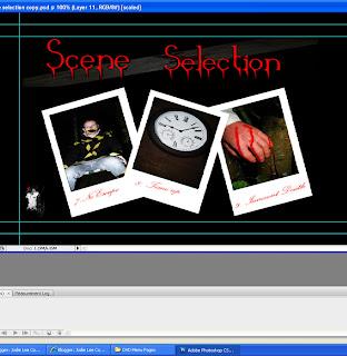
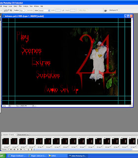
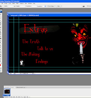
I have now completed my DVD Menu Pages which were editted & completed within Adobe PhotoShop CS3. The pages consist of; Play, Scene Selection, Extras, Audio Set Up & Subtitles. Throughout each page i have kept with the genre & elements which imply the genre Horror. These are print previews of each page. I'm happy with the overall outcome of my DVD Menu pages & all the elements such as; the font, the colour scheme, the images & the layout, they're just as i predicted visually in my head.


Main Menu Page


Extras Page
 

Audio Set Up Page

Subtitles Page

      
Scene Selection Page (1/3)


Scene Selection Page (2/3)
  

Scene Selection Page (3/3)
 

Friday, 5 November 2010

Mood Board of my own Images

This is my Mood board of my images seen in my DVD Menu, i have added annotations to explain the use of Fonts, Props, Images, Colours etc.  All images in this mood board are my own & are seen within pages of my DVD Menu. The font seen is also from my DVD Menu, the red symbolises blood to enhane the nature of the Horror genre. All props seen were brought for this Photoshoot for my DVD Menu, i'm pleased i brought all of them, even though some are only used once throughout my DVD Menu. I brought props such as, Warning Tape, Glow in The Dark Spirit, Masks, Knifes, Fake Blood, Hanging Doll etc. I feel all props portray the genre of Horror really well & i believe all aspects from the Font, Images, Colour Theme successfully portray Horror.

Making my DVD Menu Pages


In the making in my DVD Menu pages, it is vital to make sure all elements related to the genre, therefore putting this into consideration, i kept the dark colour theme of red & black throughout every DVD Menu Page, & the Font i kept red with an effect of seemingly like blood. The images throughout the DVD Menu were fairly dark inititally as i took them at night, however i still touched them up by editing them on Photoshop. I used effects such as brightning & contrasting to create a tense tone, i also de-saturated some slightly to make them appear even darker & slightly black & white. I also changed all colours within some images, in other words with the lasso tool, i highlighted certain areas of the image & by inverse, editing different areas, i.e making most of the image black & white & editing some of the areas in colour to stand out more & to enphasise the red colours.

I have now completed my DVD Menu pages, & i'm very pleased with them. I've made them simple, clear & clean but still effective & scary. I have made pages for; Main Menu, 3 Scene Selections, Audio Set Up, Extras, Subtitles. I took around 300 images, therefore i had to narrow it down & choose the main ones to edit, i narrowed it down to around 20 of the best ones & editted to the nature of Horror. Most Pages were split-screens, where half of the page is a plain background & the other half is an image. The other ones were the Scene Selection pages, which i knew from the start i wanted to make different, i decided to use the style of polaroid images, as i wanted to portray the scene selection pages as a 'crime scene board' & the seen images are for the police as 'evidence' of a mass murder. Therefore in Photoshop i created a polaroid layout & individually added my chosen images inside the polaroids. I'm pleased in how the Scene selections look, they are just how i expected.

Overall, my DVD Menu Pages, i'm happy with & i have kept with the genre Horror through elements throughout the pages. I've kept the colour theme, image tones & layout moderately similar, as i wanted to portray a scary, simple DVD Menu, the clear nature of the DVD Menu i felt would add a creepy effect, to portray a tense atmosphere & loneliness.

Wednesday, 3 November 2010

Taking my images

This is an image of a 'hanging skeleton', which i hung on the tree, i felt this image was simple but in effect
still very scary as you initially don't know what to think about it. I edited this image to black & white & with the
history tool brang the colours of white & red black, to stand out.

My boyfriend tied up in a chair with warning tape to appear as a 'victim' in my 'film', his facial expression also
scared, to emphasise his danger, i felt an image like this would question the audience such as, 'who tied him up?', 'whats happened?'. The effect i was going for. I also edited this image by De saturating it & using the curve tool to brighten & contrast.
A simple image of a pole on a trampoline with fake blood written 'die' on it, which would imply Horror & that people are in danger & there is a killer about. I also edited this by using the curve tool to brighten & contrast to make the red blood stand out more in contrast with the grey pole.

A simple image of a clock, i felt would look effective as the clock is old & timed late, i wanted to use this in my DVD Menu by saying 'times up', to portray danger, death & anxiety. I edited this slightly, as from being taken at night in the dark, it was fairly dark but slightly using the curve tool by contrasting & brightening the image.


I have now taken my images or Horror. One night in half term, i spent taking my images for my DVD Menu's. I brought lots of props to portray Horror; Masks, Fake Blood & Knife, Warning Tape, Glow in the Dark Spirit, Fake Arm, Skeleton, Hand gloves etc. I used these when taking my images, my actor was my boyfriend Leon, who modelled the masks & portrayed as a 'killer'. The images were taken in the woods in Goodwood & in a garden. I used close ups of the masks to portray the danger & scare the audience, & long shots for DVD Menu pages images. I edited a few in Photoshop CS3 & enhanced, contrasted the colours. Also using black & white to create a more tense image.

I'm pleased with all the images i took & i feel they portray the genre Horror, & the use of props has enhanced the danger & horror within my DVD Menu. I'm now moving onto created pages in Photoshop CS3 for the Main Menu, Scene Selection Pages, Extras, Audio Set up & Languages. My expectations & visual thoughts are exactly how i wanted in these images. I edited in Photoshop & changed colours, lighting, cropping etc to enhance the nature of Horror. I experimented with a number of props to portray different aspects of Horror e.g. Scary Mask, Someone Hanging, A simple doll of a skeleton on a tree to look creepy, a Glow in the dark Spirit to symbolize a sign of some kind, & make people ask questions.

An image of my boyfriend in a mask which was red anyway to emphasise the 'bloody theme', also in this image i brought a 'fake knife' & put him in a pose to threaten & scare the audience, i edited this by De saturating the image & making the colour mainly only the red mask, to stand out & appear more scary. 

This image i decided to have my 'killer' character sitting on a chair with a 'fake arm' & 'fake knife'. Looking directly at the audience as if the character is again threatening the audience. I edited this one by De saturating, & with the history tool showing colour only on red, e.g. 'blood' on the knife & arm, red mask, i feel it's stands out & is effective.

This is a 'glow in the dark spirit' i brought, my idea of using this was to portray darkness & show it as a 'sign', from an unknown 'killer', i thought this was effective & the yellow stands out. I lowered the shutter speed on the camera to achieve this 'moving' effect to add effect. I simply used the curve tool to brighten & contrast as i felt the yellow was already very bright.
This image is quite disturbing, but then again Horror films are disturbing in themselves. This is 2 images cropped into one, i achieved this by taking an image of my boyfriend standing on a chair & then his danging legs & cropped them to appear as if he is 'hung', i used the clone stamp tool to make the trousers look the same. I put a bin liner on his head to enhance that he has been hung. I edited this image by brighten & contrast & also desaturated it to appear black & white and by using the history tool leaving the warning tape still yellow.

Update of Pitch & Development

On Wednesday i presented my Pitch/Proposal to the class, which included all my ideas of;
  • Colours; Red & Black
  • Fonts; Blood
  • Images; Scary
  • Characters; Masks etc.
My Presentation from Prezi also included my research of what I'd like my DVD Menu to look & how to portray the genre Horror. I told the class how I'm going to relate the genre to the elements throughout my DVD Menu for example Horror is dark, gory & scary, therefore I'll use dark colours to portray the darkness & use elements such as blood, masks to scare the audience. I pointed out my target audience & there likes/dislikes & what  i need to show to intrigue my target audience. I was pleased with how my presentation went, i included everything that was asked, & layed it out well. The Feedback was very good & I'm glad i used the newly introduced to me, programme Prezi, it was the first time i had used this website, & i will never go back to PowerPoint, i find Prezi is fun, easy & exciting. It looks so much interesting & appealing, layed out how Prezi does.

I am now visually imaging my DVD Menu Pages; the images, layout, fonts etc. I have portrayed them out onto paper to develop my ideas further as i go. I have sketched out the layout of my DVD Menu's. From the past weeks, i have researched throrough into Horror & Thriller & know the elements which should hold to portray these genres. I've also learnt about Codes & Conventions within DVD Menu's & the main feature elements, which has helped me when planning & researching the elements of the genre Horror. The Codes & Conventions such as, roll-over effect, images, moving images, sub-menus are popular elements within DVD Menus, which i'm going to take on board when creating my DVD Menus.

I am now going to start producing my moodboard of Horror, to portray all the elements related to Horror such as, Colours, Fonts & Images. I'm also starting to think about taking my images very soon.

Mood Board
This is my Mood board of my genre Horror which portrays elements of horror such as Scary images, Images of masked people, Dark font of Red & Black, Textures related to Horror. I also added one of my own images which shows elements of Horror, the pole with 'blood' on saying 'DIE'. The images used in the Mood Board portray danger & scare the audience, they're powerful & striking. The font is red symbolizing blood & relates with the blood splattering across the Moon Board. This Mood Board enphasises how my DVD Menu pages are going to look, with red font to represent blood. Dark, scary images of Masks. Textures such as Tape. Overall my Mood Board of Horror includes elements of Horror such as;
  • Dark Bold Colours; Red, Black & White
  • Dark images using dark colours of either a character in danger or a 'killer' to intrigue to the audience.
  • Textures related to Horror of Blood splattering to imply danger, type to suggest a killer will use tape.
  • I've also included one of my own images of a pole of 'blood' writing of 'Die', to portray Horror.
Here's my sketches for my DVD Menu:

Wednesday, 20 October 2010

Photoshop pratice Animation

Today we have been practicing Animation with images from the Internet. My first practice was of a dolphin swimming in the sea which i was pleased with. After this practice i got the hang of it quickly & learnt a lot, therefore i advanced myself & done another one with the Genre Horror like my DVD Menu, & added titles etc. This is how I'd like my DVD Menu to be similar to this in relation to location, character & colour scheme & font.
I added an image of a little girl & put the girl lacking with opacity appearing as a ghost, & then duplicated this layer & made the opacity more, to make her appear more, then added layers in between which then made the effect of her faded in and out like a ghost.

Tuesday, 19 October 2010

Proposal Update

For the final product for our DVD Menu we were asked to present our pitch/proposal in either Powerpoint Presentation or a newly introduced website called Prezi.com. I have now completed my Proposal presentation on Prezi.com, which included the following options of my DVD Menu:
  • Genre
  • Target Audience
  • Colour theme
  • Fonts & Existing Fonts
  • Textures & Existing Textures
  • Location
  • Budget
  • Mood board
  • Images & Existing images
  • Layout
  • Character
  • Props
  • Roll over effect
I was introduced to Prezi as an option to present my proposal & at first impression, my initial thought was it looked confusing but after practice i soon got the hang of it. I enjoyed using Prezi & found it very interesting & makes presenting work fun. I'm glad i chose Prezi as apposed to PowerPoint Presentation, because Prezi is different, fun & easy to use after a while. I'm pleased with my final Presentation of my proposal. This is a print screen shot of my proposal which i will be presenting to my class.

Friday, 15 October 2010

Final Idea Development

Today's lesson i finalised my final idea's on my DVD Menu, progressing of my presentation of my proposal on Prezi, finished of Contiguency Plan, Printing of finished work:
  • Contiguency Plan: I have completed of my Contiguency plan, which will help me through my project, as if finding any problems, i have a safe solution. Through the plan, it suggests possible problems i could face, but now i have thought ahead of myself, hopefully there will be no problems occuring through creating my DVD Menu
  • Proposal: I am creating my propasal in a presentation called Prezi, i have added some research into my genre, & added all my initial ideas for my DVD Menus, including; font, images, location, textures which i'd like to use in my DVD Menu.
  • Initial Idea's for my DVD Menu: I have completed my final ideas including, the font's i'd like to use, images, location, textures etc. I have also completed the research on my target audience & the legal & ethical issues when producing a DVD Menu. I also researched into prices of DVD Menu's, & completed the budget of my DVD Menu.
  • I also managed to print of my Annotated moonboards, & my deconstructed movie posters on a word document.
I'm happy with the work completed so far & my inital ideas.
Target: I need to finish of my Prezi Presentation.

Progress on Encore


Through progressing on Encore, i have created a demo of a DVD Menu. Created on Adobe Photoshop, i learnt all the aspects through layers, shapes & the image. I learnt how to add shadows, & how important it is putting each title into folders, as they get quite editted. This lesson on Encore & how to create the basics of a DVD Menu on Adobe Photoshop helped me a lot, & developed my skills in Photoshop. I now am able on my own, to create a DVD Menu, & i know how to change titles, colours, shapes etc.

Introduction to Encore

Today we were introduced to a programme called Adobe Encore which i will be using to create my DVD Menu, i had never used this programme before, & my first impression was it looked confusing, but once getting to know tools etc, it was very interesting. Through creating a DVD Menu, we will need to create it on Photo shop then import it into Encore. Through learning the basics on the programme of Encore i have learnt the following so far:
  • I learnt how links are made between buttons within a DVD Menu, & i linked a moving image to the DVD Menu of 'ninjas', which then played a clip of ninjas on the DVD Menu, which looked really good.
  • We have been introduced to a Hard Drive which i have learnt, to create folders on & save work onto.
  • I learnt how to create the timeline of the DVD Menu, therefore every second of the clip appears & you can edit & manipulate any particular part.
  • I identified Shortcuts on the Keyboard, which makes it easier & sufficient; saving projects by using Ctrl + S, this makes it easier for me as i can save as i go along quick & easy. Another easy shortcut was Ctrl + Alt + Space Bar, which allows you to preview so far produced work.
  • I also learnt how to import successful a project, by simply right-clicking on the left hand side of the screen & where projects are listed, click down to 'import as' & you can open a file.
  • I also learn that when importing a file, it is important to use the correct option of how it will upload. It is best to use DVD Menu & Timeline, to see each step of work progress & to have the ability to edit any part at any point.
With praticing Encore today, it helped me a great deal, as with just simply recieving the helpful hand book, i may have struggled, but actually using Encore as a 'test project' i found it very useful & i understood it clearly. Therefore when starting my DVD Menu, i will have the skills & ability to produce a successful Menu.

Friday, 8 October 2010

Final Idea for my DVD Menu

I’m creating my own independent DVD Menu, including my own images thrilling images. I have chosen Horror, to relate to my Movie Poster, & I’m going to use colours, textures/ elements to relate to my genre. I’ve put into consideration the client & the audience needs of the target audience for Horror.

Title: 

My movie title is ‘21’, the same as my movie poster. I chose numbers, as from researching horrors, their titles can be catches & they’re questionable for the audience. I found some with numbers titles such as ‘23’, a thriller with Jim Carey. My whole title on my movie poster & my DVD menu, is ‘2 sides 1 person’, but to shorten it and make the audience intrigued & wanted to know answers, I simply put it as ‘21’. I felt this title is simple but interesting.
Colour Scheme:  
Horror films use the colours, black & white, reds & dark colours, to associate with the genre. The colours I will use is, black & white, red, i feel the black portrays the darkness of the nature of the genre, the white to imply the innocence which could be in danger in the film & also white stands out & contrasts well with the other colours. Lastly, the colour red which i feel is really effective when using the genre Horror, as it represents blood which implies danger, also i feel this colour is very bold & stands out well.
Font: 


The font will be bold, red colours to relate to blood. The style will be ‘Monotype Corsiva’  as I feel looks almost old & interesting. Of different sizes & colours with white lines slicing through the writing which reminds me of barbed-wire which is dangerous.
Textures:  
From researching textures, I know I’d like to include ‘Crime scene’ tape across my DVD Menu, with ‘duck tape’, as the background to my titles. Almost like a plan from a psychotic or a crime investigation board. Textures such as Warning Signs, Red paint spattered like blood also portray the genre Horror, & imply danger & death. I also feel textures such as these, really stand out & intrigue the audiences eyes.

Warning tape to imply something bad has happened,
& danger & death is close

Tape to portray Horror

Red paint splattered to portray Blood

A warning danger sign, to portray the danger of
Horror

DVD Menu

We're now investigating & researching into DVD Menu's as our next assignment. We have looked at a number of DVD Menu e.g. Hangover, Fahrenheit 9/11 etc. I've learnt there are elements & code & conventions of DVD Menu's to imply the Genre of the film. Elements, Codes & conventions such as;
  • Rollover effects (When you select an option & it highlights)
  • Colour Scheme
  • Images
  • Fonts
  • Animation
  • Textures
These all would relate & link to imply the nature of the Genre. E.g. For the Genre of Horror the elements would be similar as the following;
  • Rollover effect- White font to Red
  • Colour Scheme- Red, White & Black
  • Images- Dark & Scary
  • Fonts- Bold
  • Animation- A character appearing from the DVD Menu
  • Textures- Blood, Tape, Knifes etc.
This is an example of the elements which would portray the genre Horror. Horror is very dark & scary, therefore the colours would have to be dark to imply this. The colour Red is always popular when showing Horror, as it represents blood & blood is closely seen with Horror as it implys death & danger.
We've been given the choise of Indie Horror, Indie Drama, SCI-FI & Childrens Animation, i've listed the elements & codes & conventions which would be seen & used to portray the specific genre.

Children’s Animation
Colour Scheme:
Children like bold, bright, exciting colours to keep them engaged. Children can be easily distracted so it’s key to keep them engaged. The colour Scheme for children; Bright yellows, reds, blues, greens.
Font:
To keep the children excited, fonts should also be big bold & bright. Therefore Big bold fonts, using the colour scheme of bright colours.
Images:
Moving images to keep them intrigued in the DVD Menu of bright, happy characters; cartoons. Animations of bright characters.
SCI-FI
Colour Scheme:   
Dark Metallic Green & Black, Greys. SCI-FI is very scientific & related to space with is black. When presenting SCI-FI films these colours are associated, therefore, I would use Black & dark metallic greens to present my film.
Font:
The fonts used are very hi-tech, modern & scientific relating to the science-fiction genre, therefore I would use ‘computer’ scientific font to enhance the modern, hi-tech theme of the genre.
Images:
Images are very hi-tech & technological relating to the science fiction genre. I would use moving images of hi-tech, modern elements, such as robots, computers etc. The DVD Menu would be very technological & hi-tech. Heavy Animations.
Horror
Colour Scheme: 
Horror films use dark colours to relate to the dark nature of the film. Black & white, red are associated with Horror films I found, as it can represent blood. However I would use Black  & yellow to make the characters glow & stand out.
Font:
The Fonts use are very big, bold & dark to stand out & to relate to the genre. I would use big, bold yellow titles to stand out.
Images:
Images are also dark & scary to relate to the genre. I would use Static images & Moving images to show scary clips from the movie, & shocking static images. The images & moving images would be dark & bold, to scare & intrigue the audience.
Drama

 Colour Scheme:
Drama films base on realistic characters dealing with emotional themes such as; Drugs, Alcohol, Love, Religion, Crime etc. Therefore the colour scheme would range heavily, but would still use very bold colours to emphasise the drama. For example Love would use Red colours & hearts, where as Crime would use darker colours such as black & yellow. I would use Red to imply a Theme of Love to stand out & contrast with a white background to also portray the innocence and drama.

Font:
The fonts would also range a great deal, as drama as such a wide range of dramatic aspects & themes. I would use bold red fonts to relate to the red colour scheme & contrast with the White background.

Images:
Images would again, range as the themes vary, however as my theme would be Love, i would take images of couples together ' in love' & use poses of them kissing, cuddling, etc to imply the nature Love & relate to the colour scheme & font.

After thorough research into these 4 genres, I've decided to choose Horror as i find it interesting with the use of dark colours, dark images & textures such as tape, knifes, blood etc. I personally enjoy Horror films & how all the elements relate & enhance the genre, however i haven't chosen Horror because of this, I've chosen this as from researching DVD Menu the movie 'Crash' a Drama Thriller, used Polaroid Images to portray the characters within the Film, i really like the use of this, & from researching into it, i feel Polaroid Images remind me of Crime Scene Investigation, where they have images like this of the victims, therefore i decided I'd like my DVD Menu to include Polaroid Images to enhance the scary dark side of the genre. I'm still researching into Horror in-depth & have found textures I'd like to use such as, Duck tape, Warning Tape, Blood etc.

This is a deconstruction of the film 'Friday the 13th' which i've highlighted the colour scheme, font, images etc. All the elements portrayed & the feel of this DVD Menu is what i'd like my DVD Menu to similarly look like.

More Research into the 4 Different Genres of; Indie Drama, Indie Horror, Children's Animation, SCI-Fi, These are screen shots of the pages from Microsoft Document;


Skills Profile

I will need to include in my Blog over the next two years
  • Skills i have already
  • Skills i have improved on
  • Skills i'd like to improve on
  • Goals
  • Achieved Goals
  • My Targets
  • My Work in Progress
After my first week of college, we analysed posters, moodboards, and draw 3 sketches.
Today we used Photoshop to analyse existing movie posters which i have done before but did enjoy analysing & deconstructing elements put into the poster for the audience.
I have used Photoshop before to create Magazine front covers, double page spreadsheet, edit a high number of photographs, but today i learnt even more then i did, with hidden tools & short cuts.

Positives
  • Can use Photoshop & all the different tools & techniques
  • Create a moodbaord and annotate onto
  • Short cuts on Photoshop
  • Can create a successful A4 Canvas
  • To use the 150 resolution for a successful image
  • Learnt how to change backgrounds of images without touching the image
  • How to change canvas to landscape/portrait
Consideration for my own movie poster
  • The main subject/attraction of my movie poster, rule of thirds
  • Colour & Composition to relate to my genre
  • All elements to relate to my genre of Thriller
  • An attractive, striking image
  • Font bold & eye-catching
  • Adding age certificate, main star in the film
Goals
  • I hope to make a successful movie poster
  • All elements of my movie poster to relate to the genre of thriller
  • Learn short cuts for Photoshop
  • Learn how to cut & edit out certain aspects of images

Wednesday, 6 October 2010

Movie Poster

                           This is my final Movie Poster, '21' with the genre 'thriller'.

This is my completed Film Poster. I have learnt many skills & developed on my knowledge of Photoshop through making my movie poster. I have used Photoshop heavily for past projects & coursework, however i learnt a great deal on this project. I learnt clearly how to use layers on Photoshop, which i knew how to but didn't understand fully, & now i can successful add layers on top of eachother.
I also learnt the use & important of file formats. I learnt that PSD Files is the file in which it will save all layers which you can therefore go back to, edit & annotate to. Also learning when uploading an image on the internet & viewing it successful as a thumbnail in Documents, is to save the image as a JPEG, therefore i learnt to flatten all images first, so all layers merged into one final image.
I'm very pelased with my final Movie Poster as the image i had in my head before hand & through sketches, i knew exactly the image i'd like to fulfil the thriller/horror genre. The polaroid image effect i was going for i really like, & each element of the poster from the colours of the font, to the images, which the woods one i took myself of my friend in her prom dress, to the title, added credit & age certificate. All the elements of a real Movie Poster. I learnt alot of skills from this exercise & thoroughly enjoyed it.


Monday, 4 October 2010

Adobe Photoshop CS3 & File/Sound Format & Regional Codes

Adobe Photoshop CS3

Before i started my course, i had a wide knowledge on Photoshop, as through school i did Photography & i used photoshop heavily to edit and enhance GCSE images & enjoyed editing images so spent time at home editing my own pictures. I picked it up and pretty much taught myself as i went. I also did work experience in Venture Photography Shop where i work, which i edited real customers images, and they showed me tools and easy short cuts to edit quicker. I love editing images, which i do regularly for college work & my own family pictures. I enjoy the process & seeing the final production of what I've done, in photoshop you can really enhance and change an image to stand out. My favorite is to change the image colour to black & white & putting in colour to aspects such as flowers, eye colour etc, this effect really stands out and i use a lot. Photoshop for me, is amazing, i really enjoy editing images as you can have a standard simple image, and enhance and edit it so much, it looks totally different and almost shocks you. I have made a page on my blog of 'Photography', and i have added some of my own images which i edited in Adobe Photoshop in the past on the bottom of my blog.

Differnt File/Sound Formats & Regional Codes

Today we covered different DVD Formats & Regional Coding's. I learnt how every DVD has a specific region coding & reasons being. I also learn the different DVD formats which include different advantages. I found out through research that the reason being for regional codings is down to Copy Right purposes, for example America bring out movies before us, therefore someone cannot get one from there & copy it as it won't work in the UK, as the region code for the United States is 1, where as in the United Kingdom is is 2, therefore the UK DVD players should only play DVD's with the region code 2.

This is a big advantage to the Movie Companys, as they will gain maximun profit, as people can only buy the DVD in their own Countries regional codes. If there was no such thing as Regional Codes, Movie Companys will loose profit, as Countries worldwide will constantly sending them over from one Countrie to another.

I also learnt about different Sound formats & DVD Formats, with some having the ability to re-record, where as others cannot. I found this was very interesting to find out all the different DVD formats, from
DVD+R & DVD-R to DVD RAM which old different advantages & disadvantages. I didn't realise just how important & vital it is when using a DVD format, when wanting a certain aspect. I also learnt different Sound formats such as Dolby Digital to Dolby Digital Plus, which hold different defnitions & channels of sound. Sound Formats are also important, as different sound to a movie can change are perception of it, for example a horror movie with loud scary music, we won't get the full effect if it's not loud & sourround sound.

This has enhanced my undestanding of Regional Codes, DVD & Sound Formats.

Friday, 17 September 2010

Mood Boards

Mood Boards are boards containing  images, text, objects of the same mood e.g. Horror would show dark colours, dark images. Anything relevant to the mood of genre, can be put on a mood board. I have found a good example, which shoes different sections of all genres, with related images & texts. A genre is a category of the same elements and conventions. It is vital the genre comes across to the audience, so they know what genre of film they're going to watch. Everyone has different taste in genre, therefore there cannot be false advertisement, for example if someone enjoys comedy but they find there is violence, that wasn't the film they payed to watch or buy. Genres can get multiple & slightly confusing, therefore Directors have created sub-genres, for example a 'romantic comedy' 'chick flicks', 'fantasy', which would be mixture of two genres, so involving elements from different genres; for example, romance & comedy combined. This mood board shows film genres & sub-genres. These are also other moodboards with a simple genres.
I have starterd my moodboard by getting images of google of thriller posters. I'm also going to add texts/images from magazines/newspapers.
This is my Moodboard for my Movie Poster with the genre 'Thriller'.